Case study · University project · Web · 2018
A responsive movie blog front-end, built with Bootstrap. Three film categories, a cinematic home page and a complete account flow.

A static front-end for a movie blog, built to show what a front-end framework brings: the same content, rebuilt with Bootstrap, becomes a responsive and polished website.
A home page with a film carousel leads to three categories: Survival, Sci-Fi and Marvel, each on its own page.
Complete login, registration and password recovery pages, ready to be connected to a backend.
Built on the Bootstrap grid, every page adapts from large desktops to phones, with a navbar that collapses into a menu.
Movie World is a movie blog and database for fans of action cinema. Its titles are organized in three categories, Survival, Sci-Fi and Marvel, each with a stand-alone page reachable from the navbar, next to the account pages and an About Us page.
It was built as a university project about Bootstrap, the most popular front-end component library: what it is, why it is worth using, and how it compares to raw HTML. The whole website was designed in Bootstrap Studio, then rebuilt without the framework to show the difference.
Site map: visitors browse from the home page, About Us leads to the account pages
Present on every page. The page icon doubles as the home button, and on phones the links collapse into a menu.
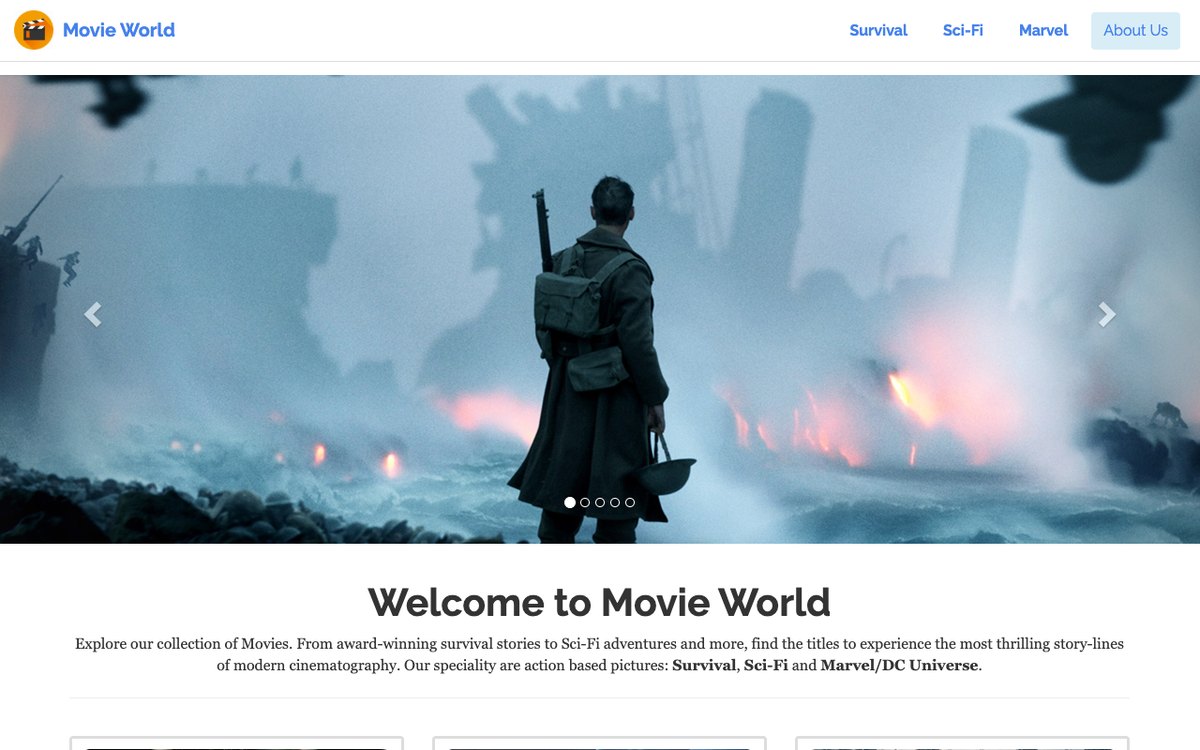
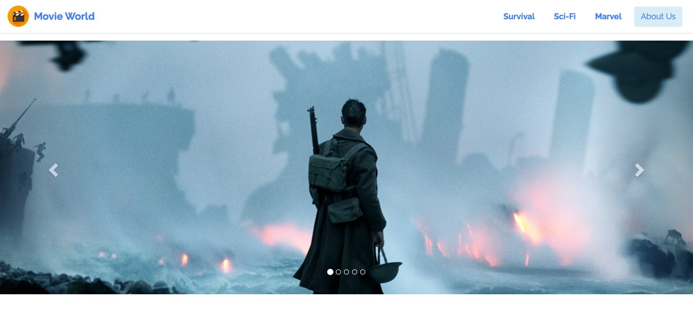
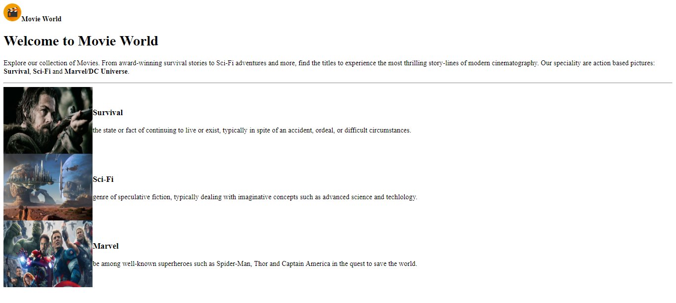
A film carousel and a welcome text introduce the site, and three thumbnails lead to the categories.
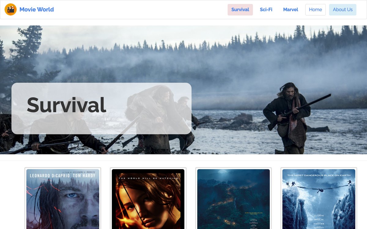
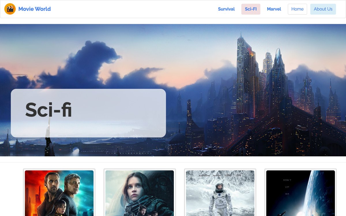
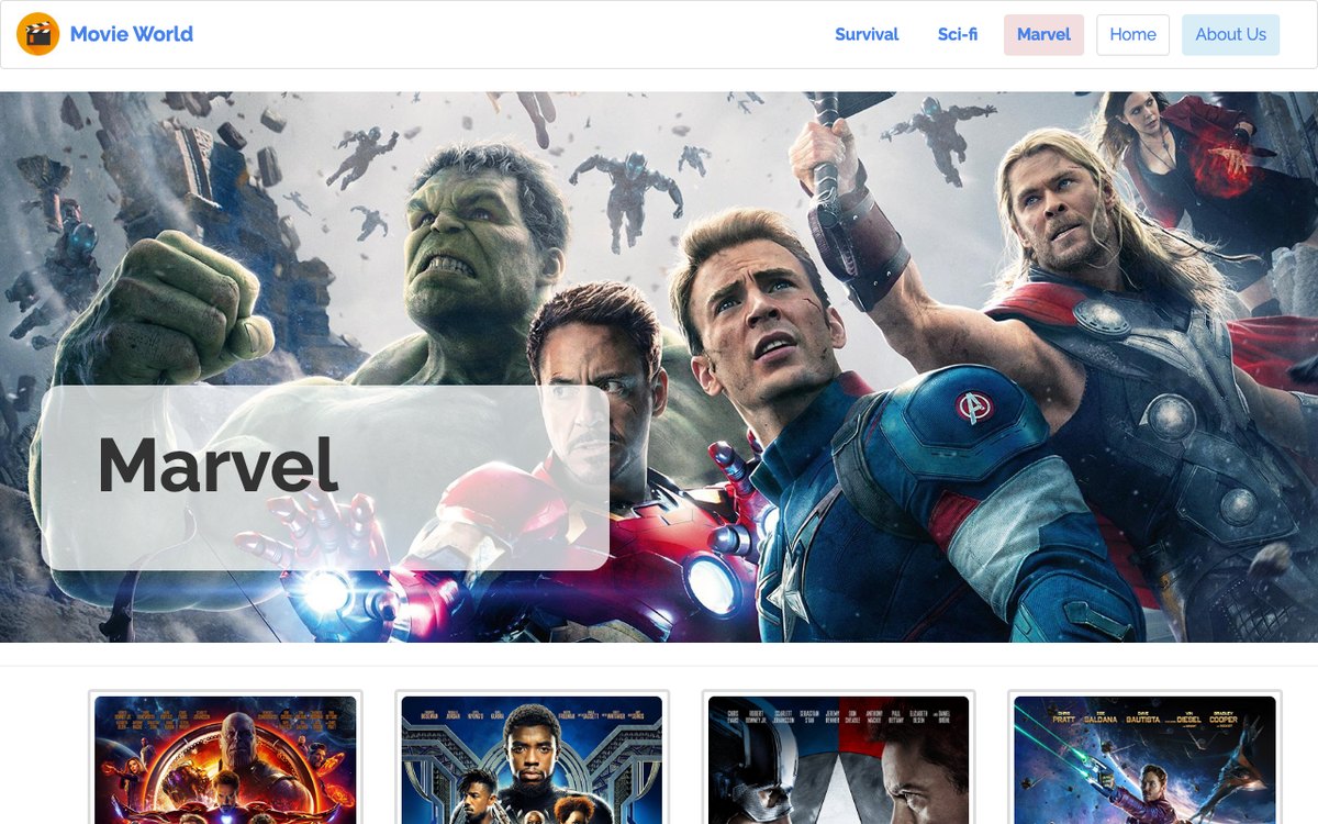
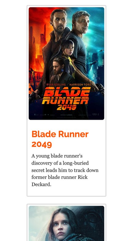
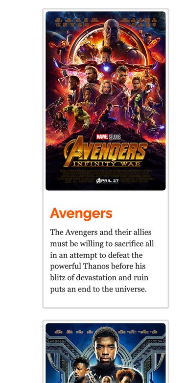
Survival, Sci-Fi and Marvel each list their movies with a poster, a title and a short description.
General information about the service, with the address, phone, email and social links.
Login, registration and password recovery, each built around a simple, focused form.
The home page opens with a full-width carousel of five film stills, with arrows and indicators to move between them. Below it, a welcoming heading and paragraph introduce the collection and its speciality: action pictures.
Three thumbnails, framed in grid columns, present the categories, each with an image, a title and a description. Every element is a standard Bootstrap component, styled with the Bootswatch theme and the Raleway font from Google Fonts.
index.html · navbar<nav class="navbar navbar-default navbar-fixed-top">
<div class="container-fluid">
<div class="navbar-header">
<a class="navbar-brand navbar-link" href="index.html">
<img src="assets/img/icom.png"><strong>Movie World</strong></a>
<button class="navbar-toggle" data-toggle="collapse">…</button>
</div>
<div class="collapse navbar-collapse" id="navcol-1">
<ul class="nav navbar-nav navbar-right">
<li><a href="survival.html"><strong>Survival</strong></a></li>
<li><a href="sci-fi.html"><strong>Sci-Fi</strong></a></li>
<li><a href="marvel.html"><strong>Marvel</strong></a></li>
<li><a class="bg-info" href="about.html">About Us</a></li>
</ul>
</div>
</div>
</nav>
NAVBAR
Fixed to the top of the home page, with the page icon as home button and the categories on the right. On small screens it collapses behind a toggle.
CAROUSEL
Five stills from Dunkirk, The Hobbit, The Shape of Water, The Revenant and Blade Runner 2049, with Glyphicon arrows and indicators.
TYPE
A heading and a paragraph that invite visitors to explore the most thrilling story-lines of modern cinema.
THUMBNAIL
The three categories, framed in col-md-4 columns, each with an image, a title and a short definition of the genre.
Each category has its own page, built on the same layout. A wide film still sits behind a translucent jumbotron showing the name of the category.
Underneath, the movies are listed as thumbnails in four col-md-3 columns. Every thumbnail represents one movie, with a rounded poster, the title and a short description of the story.
4 TITLES
Stories of continuing to live in spite of every ordeal: The Revenant, The Hunger Games, The Lost City of Z and Everest.
4 TITLES
Speculative fiction and advanced science: Blade Runner 2049, Star Wars, Interstellar and Gravity.
4 TITLES
Well-known superheroes on a quest to save the world: Avengers, Black Panther, Captain America and Guardians of the Galaxy.
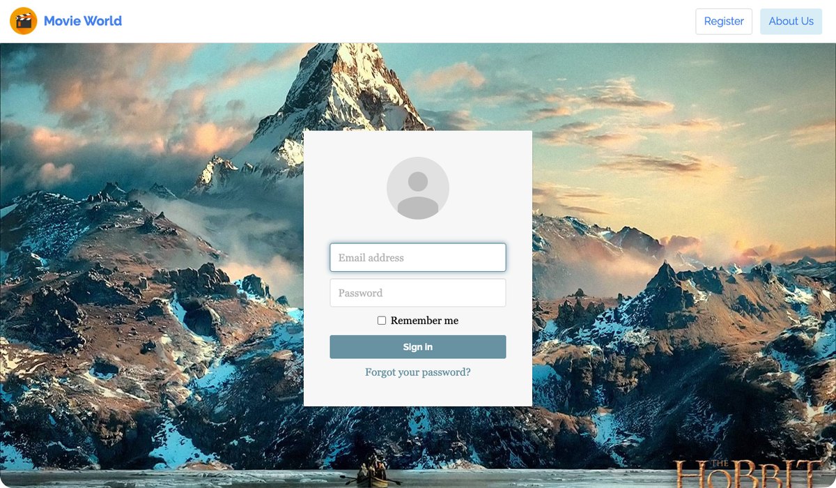
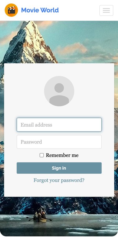
Visitors log in to their accounts to access the website, over a full-screen landscape from The Hobbit. The login card is centered on the page, with a placeholder profile picture above the form.
New users find a Register button on the navbar, and a link under the form helps those who forgot their password. Every form uses Bootstrap's form controls, with labels, inputs and buttons that line up on any screen.
FORM
Email and password inputs, a Remember me checkbox, a Sign in button and a link to reset the password.
FORM
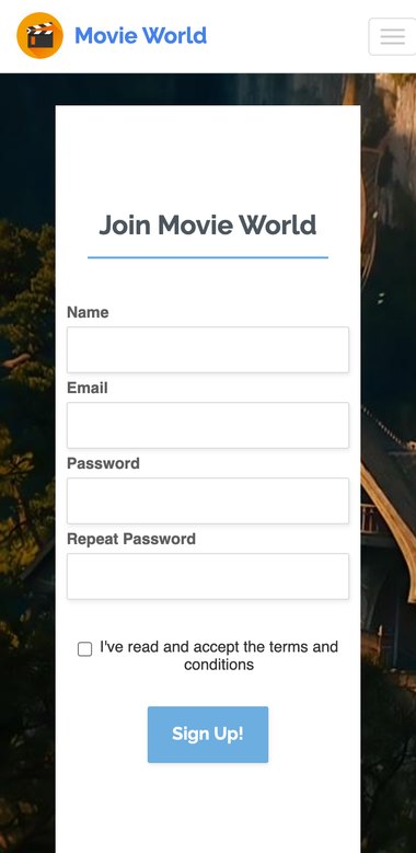
Signing up is simple and fast: name, email, a password typed twice, and a checkbox to accept the terms before Sign Up!
FORM
A single email input. A password reset request is sent to the user's email client.
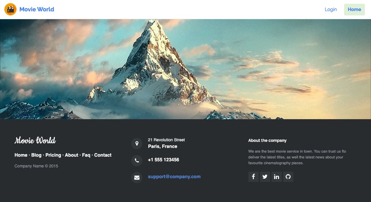
Linked from every navbar, the About Us page gives general information about the service and its contact details.
Its dark footer shows the company in a script font, quick links, the address, phone and email, each with a Font Awesome icon, and links to Facebook, Twitter, LinkedIn and GitHub.
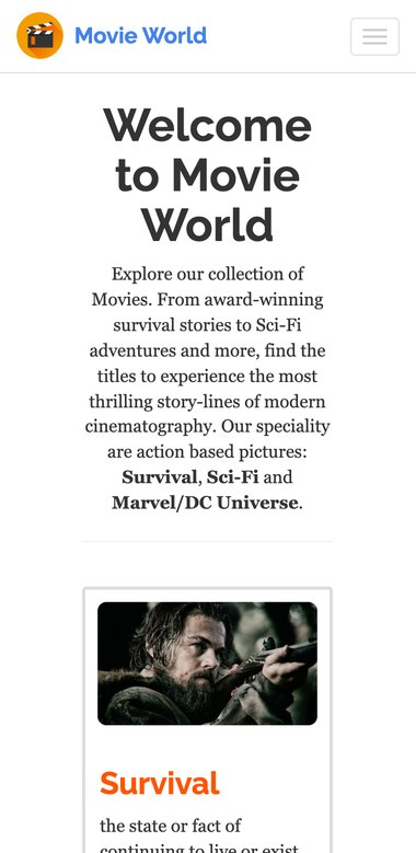
Responsive web design is about creating websites that adjust themselves to look good on every device, from small phones to large desktops. Bootstrap 3 is mobile-first: on screens narrower than 992 px, the grid columns stack, the thumbnails fill the width and the navbar collapses into a menu.
WELCOME
The welcome text and the category thumbnails stack into a single column, with the menu behind the toggle.
SURVIVAL
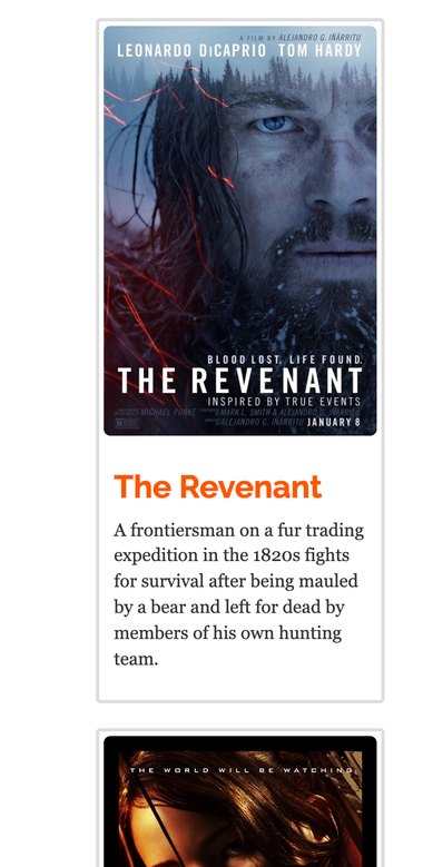
Posters grow to the full width of the screen, keeping titles and descriptions easy to read.
SCI-FI
The same col-md-3 columns that sit side by side on desktop become one scrolling list.
MARVEL
Every category page shares one layout, so the whole site behaves the same on a phone.
ACCOUNT
The login card stays centered over the landscape, sized to fit the screen.
ACCOUNT
Labels move above their inputs, so the form fits in one comfortable column.
Bootstrap is a free, open-source toolkit for developing with HTML, CSS and JS. It includes design templates for typography, forms, buttons, navigation, image carousels and many other components, plus optional JavaScript plugins built on jQuery. Movie World was designed visually in Bootstrap Studio, which writes clean Bootstrap markup for every component.
Anybody with basic HTML and CSS knowledge can start using it.
Its responsive CSS adjusts to phones, tablets and desktops.
In Bootstrap 3, mobile-first styles are part of the core.
Works in all modern browsers: Chrome, Firefox, Edge, Safari and Opera.
To show what the framework brings, the home, Survival, Sci-Fi and Marvel pages were also written in raw HTML, with exactly the same content. Without Bootstrap, the page loses its navbar, carousel, grid and typography. Drag the handle to compare the two.

A complete, eight-page movie website with a consistent look, built quickly from ready-made components. Side by side with its raw HTML twin, it shows how much a framework brings: layout, navigation, forms and responsive behavior come almost for free.
Connect the forms to a backend with real accounts, load the movies from a database or movie API instead of static pages, add search and reviews, and move to a newer Bootstrap version to polish the carousel and jumbotrons on small phones.